When it comes to Calgary business web design, most potential clients put a big premium on creativity. After all, if your website doesn’t look better than everyone else’s – or at least a little bit different – then what are you really paying for?
That’s an understandable line of thinking, but understand that too much creativity can actually be a bad thing. That’s because, when your website strays a little too far from conventional ideas, they can be difficult for customers to find, use, and navigate.
Here are a couple of areas on your next website that you should be careful about when it comes to being overly creative:
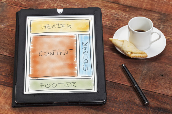
Web page layouts. Unusual layouts might look good, but they can be hard to navigate and understand. There’s a reason that most business websites are put online the same way they would be in print. It’s just easier for visitors to find important information in a top-down way.
Links and menus. Likewise, convention has normally dictated that links be underlined or identified in some way, and that menus be easy to find, and not give dozens of different options at once. By keeping things simple and predictable, you make your site more usable and easier to navigate.
Images, backgrounds, colours, and fonts. Your business website should be a marketing tool first and a piece of art second. The more outlandish your images, backgrounds, colour schemes, and fonts are, the harder it is for visitors to actually focus on your message and buy anything from your company.
Note that we aren’t saying that you can’t ask your web design team to be creative or think differently in these areas of your site – only that if you do, it should be for a very good reason and not just a desire to be “different.”


FOLLOW